Hi, I'm Isabella Marie!
I'm a graphic designer specializing in branding, packaging and layout, with roots in illustration and a passion for clear communication.

Poster - PunkFest 2024

Packaging - Luna's Art Kit

Packaging - SilverPaws Paleo Food

Branding - Summer Drop Music Festival 2025

Redesign - Esponjabón
Branding - The Blow Kiss Candle Company
© Isabella Marie. All rights reserved.
About
Hey there! I'm Isabella, a graphic design student based in Texas, originally from Venezuela. I’ve always had a love for both art and design, and with a background in illustration, I bring a creative perspective and attention to detail to every project.I enjoy working on branding, packaging, and anything that lets me combine thoughtful design with playful, expressive visuals. When I'm not designing, I enjoy creating art for myself or teaching myself how to play the piano. I mostly work in Adobe Illustrator, Photoshop, Procreate, and I like experimenting with After Effects when I can.Open for full time opportunities.

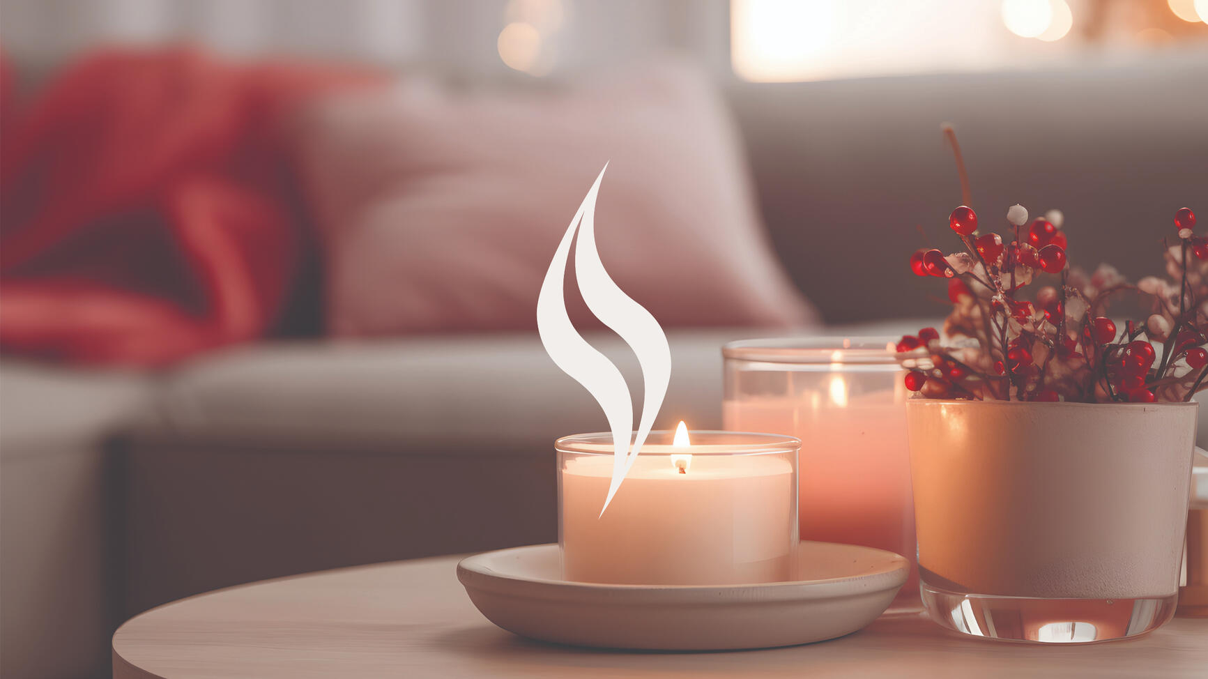
TheBlowKiss Candle Company
Brand Identity
A scented candle brand that offers hand-poured products made with natural ingredients, focused on creating a calming and elegant atmosphere. The branding reflects a minimal, feminine style with an emphasis on relaxation and simplicity.
Challenge: Develop a visual identity that feels refined and soothing while staying cohesive across brand elements.


I went with soft pastels like pink, beige, and light blue to give the brand a gentle, feminine feel. To balance it out, I added a deep wine color for contrast, which brings in a bit of boldness and elegance without taking away from the overall softness.


The logo symbol is a simple, elegant flame that embodies warmth and sophistication, reflecting the brand’s refined identity.


Business cards concept.


Label concept.
Softwares
Adobe Illustrator
Adobe Photoshop
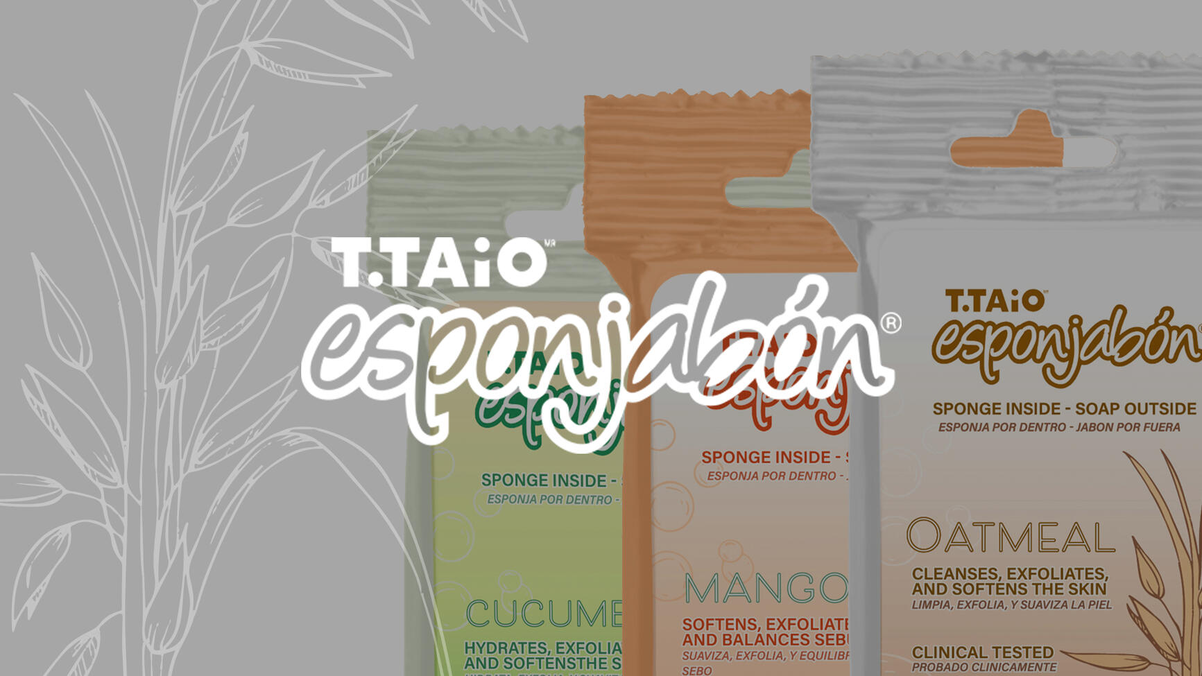
T.TAiO Esponjabon
Concept Redesign
This project was a conceptual redesign of T.TAiO's Esponjabon, a soap-and-sponge hybrid known for its multifunctional skincare benefits.
Challenge: Redesign an existing product with three distinct concepts, aiming to make it feel more elevated and visually appealing.


While the overall layout stays consistent across all three designs, each one is personalized through its color palette and supporting illustrations.
Softwares
Adobe Illustrator
Procreate
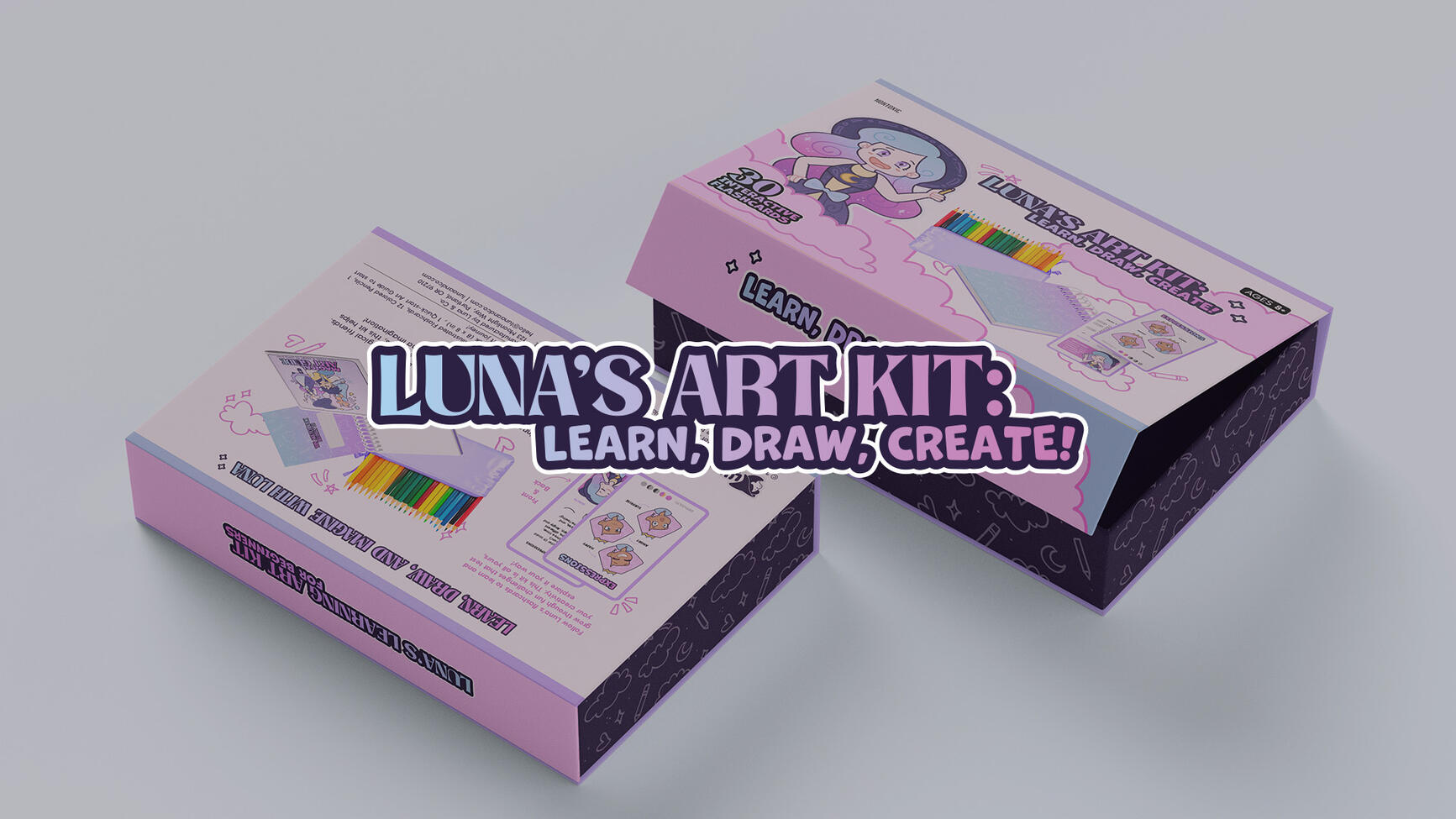
Luna's Art Kit:
Learn, Draw, Create! Concept Design
Luna Art Kit is a conceptual art kit designed for girls ages 8 to 12, aimed at encouraging creativity and learning through hands-on activities.
Challenge: Create a fun, engaging design that appeals to a young audience using illustrations and a bright, approachable style.


Light pink, light blue, lilac, and dark purple were used to appeal to a young audience. The soft tones feel playful and inviting, while the purples hint at the magical theme of the kit.


I created three characters as part of the concept to make the kit more fun and relatable for kids. These illustrations were used in different parts of the kit to add personality and support the magical theme.


The front of the box features a large illustration of the main character to draw attention and connect with the target audience. I also included visuals of the products inside, so customers can quickly see what’s included. The back of the packaging was kept simple and easy to follow, with clear information about the kit and its contents


Educational flashcard concept.


Softwares
Adobe Illustrator
Adobe Photoshop
Procreate
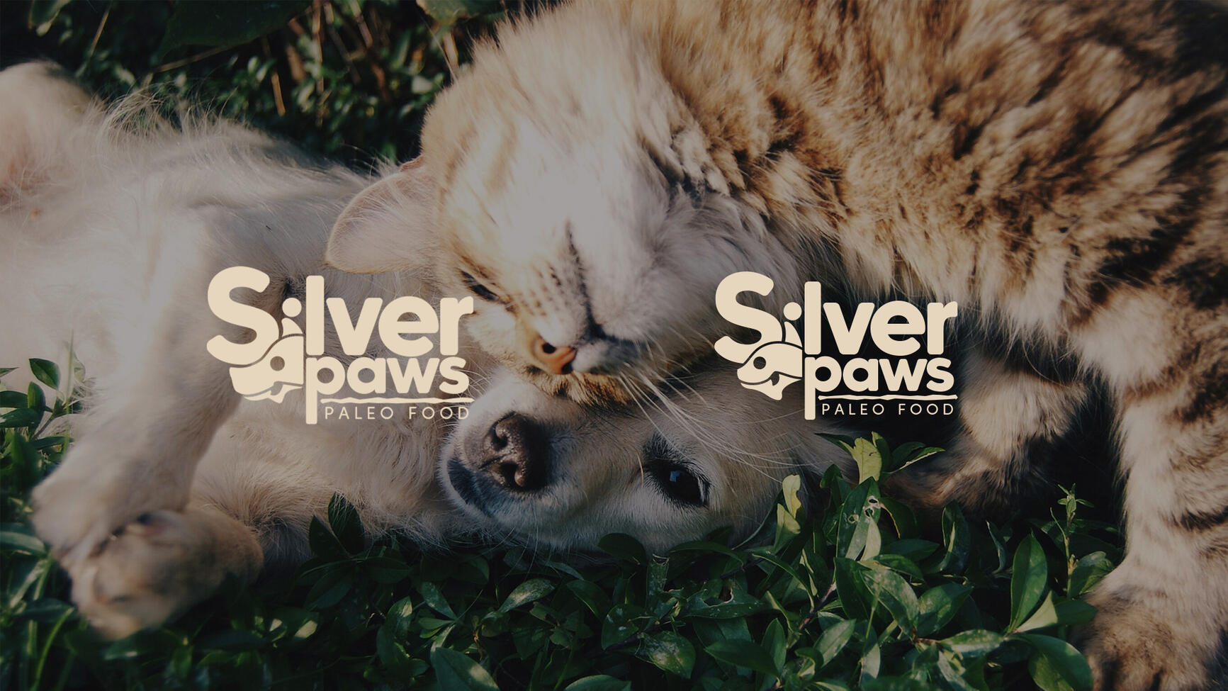
SilverPaws
Paleo Food for Dogs and Cats
Packaging project for Silverpaws, a senior dog and cat food brand based on paleo diets, designed with health-conscious pet owners in mind. The project included the logo, packaging, and rack cards.
Challenge: Develop a strong visual identity using only typography.


The packaging uses flowing text and arc-shaped design elements that wrap around the box, guiding the viewer’s eye from side to side and creating a sense of movement and continuity.

To differentiate the products, I used green and brown for the dog food to reflect natural, earthy tones with a muddy look that connects to the paleo concept. For the cat food, I chose blue and yellow, inspired by seafood and freshness, since tuna is a common favorite among cats. The colors help give each product its own feel while keeping the overall design simple and cohesive.


The brand name to reflect both care and age. “Silver” representing senior pets and “Paws” anchoring it in warmth and familiarity.


Softwares
Adobe Illustrator
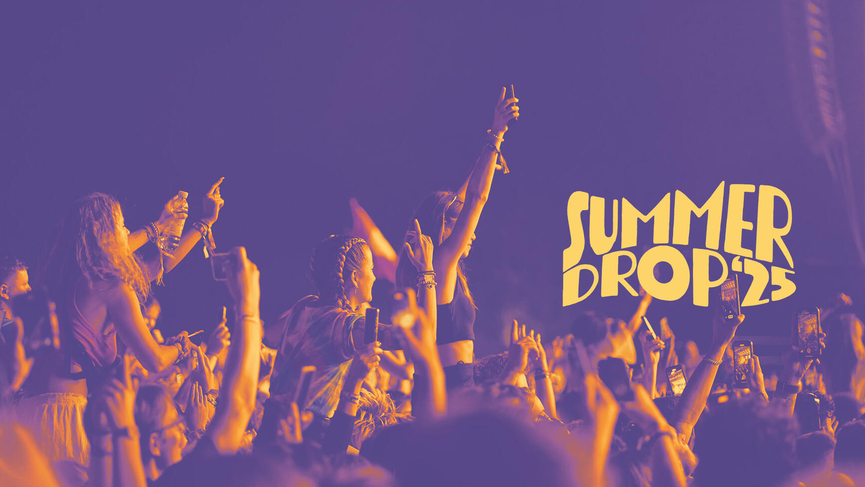
Summer Drop Music Festival 2025
Music Festival Poster & Event Graphics
A graphic design project focused on creating a bold and energetic visual identity for an imagined summer music festival, including lineup poster and ticket concept.


I focused on capturing the energy and excitement of a summer festival. I also integrated warped text into the composition to echo the rhythm and motion of music, making the overall design feel playful, dynamic, and immersive.


The palette is inspired by summer skies, using yellow, orange, and purple to reflect the warmth and energy of the season.


Merchandise and ticket designs were created to match the overall look and feel of the festival. I used the same color palette and illustrative style to keep everything cohesive and recognizable.
Softwares
Adobe Illustrator
Adobe Photoshop
Procreate
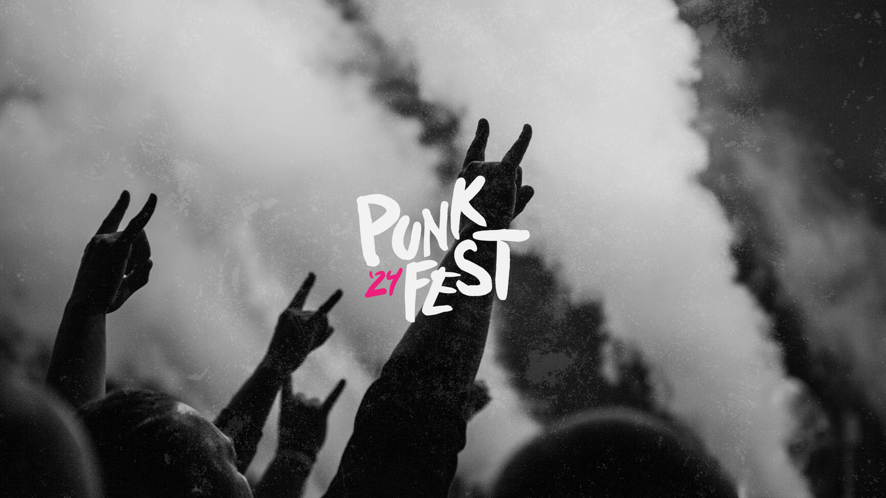
PunkFest 2024
Music Festival Poster & Social Media Graphics
Graphic design project for poster lineup for a punk music festival. I aimed to create a bold, energetic visual that captured the raw spirit of punk through both typography and color. Using decorative fonts, irregular layouts, and a neon-inspired palette, I built a design that feels loud, expressive, and true to the genre’s rebellious nature.
Challenge: Create a dynamic and impactful poster using only typography, while still reflecting the chaotic, high-energy attitude of punk


The logo uses the Punkboy typeface for its messy, harsh look that fits the punk aesthetic. I paired it with Heavitas throughout the project to create contrast. Its clean, bold style makes it perfect for readable body text.

High-contrast color palette. Neon blue and pink are used as accents, not only because they’re tied to punk culture, but also for their attention-grabbing quality.


The headliner social media posts maintain the core aesthetic of the main poster to ensure brand consistency. Each post uses a different accent color to clearly distinguish the acts while preserving a cohesive visual identity.


Softwares
Adobe Illustrator
Adobe Photoshop


